Smantry 1.42: Stocktaking in Minutes, Minimum Stock Levels and a New Look
Since version 1.39, two updates have been released, and together they shift the app’s focus. Until now, it was mainly about recording and keeping track of individual items. From now on, it’s about your inventory as a whole: With the new inventory mode, you can update an entire stockroom in just a few minutes, minimum stock levels tell you what’s missing rather than just what’s there, and the interface has been redesigned in the places you tap most often.
The new inventory mode: keeping each warehouse up to date
The most common reason why inventory in an app eventually becomes inaccurate is simple: over time, a gap develops between what is listed and what is actually on the shelf. Until now, your only option was to correct items one by one. Now there is a dedicated mode for that.
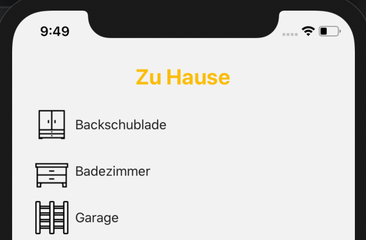
The inventory mode doesn't start with your entire stock, but with the question of where you are right now. You select a storage location—“pantry,” “freezer,” or “cellar”—and Smantry shows you only the items stored there. The on-screen prompt says it plainly: _“Start taking inventory right in front of the storage location.”_ That's exactly how it's meant to work—phone in hand, cupboard door open.
The counting flow itself is deliberately kept simple so that it runs quickly:
- Each row shows Expected and Actual. If the stock count is correct, tap "Correct"—one tap, and on to the next item.
- If it is incorrect, use − and + to correct it, then confirm by selecting "Apply".
- At the top, the progress indicator shows: _“12 of 30 reviewed”_. Use the “Open” filter to hide everything you've already checked off.
- Once all the rows have been checked, the screen displays "Everything checked!" and you complete the inventory count at the bottom.
Two details that make the difference between a counting aid and an honest supply:
Which unit do you mean? If a product with multiple expiration dates is stored in the storage location, Smantry does not guess. When you remove a unit, it asks: _“Which unit are you removing?”_—and indicates which one you should use first. When you add one, it instead asks for the new unit’s date, which you can either copy from the existing stock or enter manually.
Why is it being removed? When you reduce a quantity, Smantry asks why: _“Did you use it up, or did you have to throw it away?”_ This ensures that anything removed during an inventory count is included in your waste figures—instead of being hidden in a silent adjustment entry.
The summary: Taking inventory to its logical conclusion
An inventory count is only worthwhile if it ultimately leads to action. That’s why the process doesn’t end with “saved,” but with a summary: how many items you checked at this storage location, how many stock levels were adjusted, and how many items were removed—broken down into used up and discarded.
And then comes the part that saves you work: Smantry lists everything that has fallen below your minimum stock level during inventory directly underneath—with a button labeled "Add to shopping list". From the shelf to the shopping list, with no extra steps.
Minimum stock levels: finally see what's missing, too
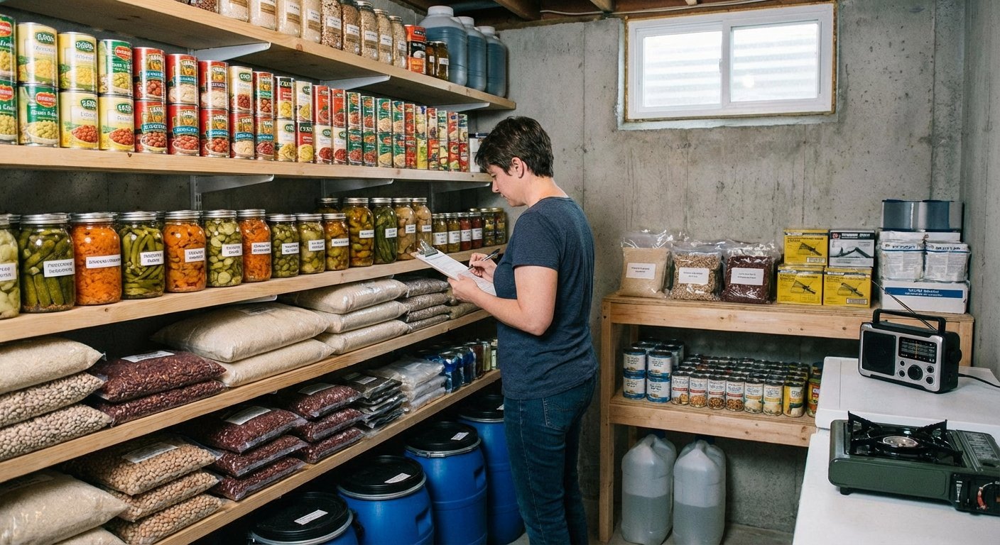
For this to work, Smantry needs to know what counts as “enough.” You define that in the minimum stock levels—not laboriously for each individual item, but by category: two kilos of flour, six liters of milk, ten packs of pasta. The screen continuously shows you how many categories are active and what is still needed to reach the minimum levels.
New in the inventory list is the handy filter: “below minimum stock”. With a single tap, it turns the inventory list into a list of missing items—the view you actually want before going shopping. (A frequently requested suggestion from the feedback portal)
And if you're starting from scratch, you don't have to come up with the numbers yourself: Use "Load template" to import a ready-made set of minimum stock levels. The quantities are then scaled to the number of people and the desired period—you say "3 people, 10 days," and Smantry does the math.
Emergency supplies according to the BBK – with real figures
The most important of these templates is the emergency supplies table from the German Federal Office of Civil Protection and Disaster Assistance (BBK). It is now available as a template in Smantry, using the published table as its source—so it contains the quantities actually listed there, rather than estimates. The source is identified in the template dialog, and a preview shows you what will be imported before you apply it.
This is accompanied by a small but important correction to the preparedness indicator: An item can now be marked as "Do not count toward emergency supplies"—intended for anything that may be on the shelf but won't keep anyone fed in an emergency. Wine and sweets are listed as examples directly in the setting description. This simply makes the statement "Prepared for 12 days" more accurate.
A fresh look for the places you visit most
At the same time, we’ve refined the interface in the areas where most of the action happens. Not as a redesign for redesign’s sake—the list of changes may sound unremarkable, and that’s exactly the point:
- The inventory toolbar is now evenly divided between search, sorting, and filtering. The search pill is labeled instead of showing only a magnifying glass, and the item count is back above the list.
- The Add button on the inventory screen is now significantly larger—the app's second most common action used to have the smallest button.
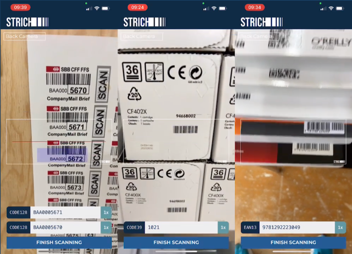
- The scanner now uses the full camera view, with the controls floating above it. The flashlight, camera switch, and manual input are all in one place instead of cropping the image.
- Instead of spinners, while loading you'll see shimmering placeholders shaped like the content that's about to appear. It doesn't make loading any faster, but it does make the experience feel noticeably calmer.
- Empty lists are no longer just empty lists—they now explain what to do next, tailored to the goal you selected when you started.
- The tab bar retains the new glass look, while the page header is back to being simple and easy to read. We tried both in glass, but that was one idea too many.
Declutter: used up or thrown away, now at a glance
The cleanup list introduced in version 1.39 has gained the step it was missing. When you remove an item from it, Smantry no longer asks why in a text dialog, but instead displays two illustrated cards: used up or thrown away. You can grasp the difference in half a second instead of having to read it.
The fact that the loading spinner appears on the card you tapped may sound like a minor detail—but it makes the difference between “I know what’s happening” and “I’ll tap again.”
Expiration dates: the finishing touches
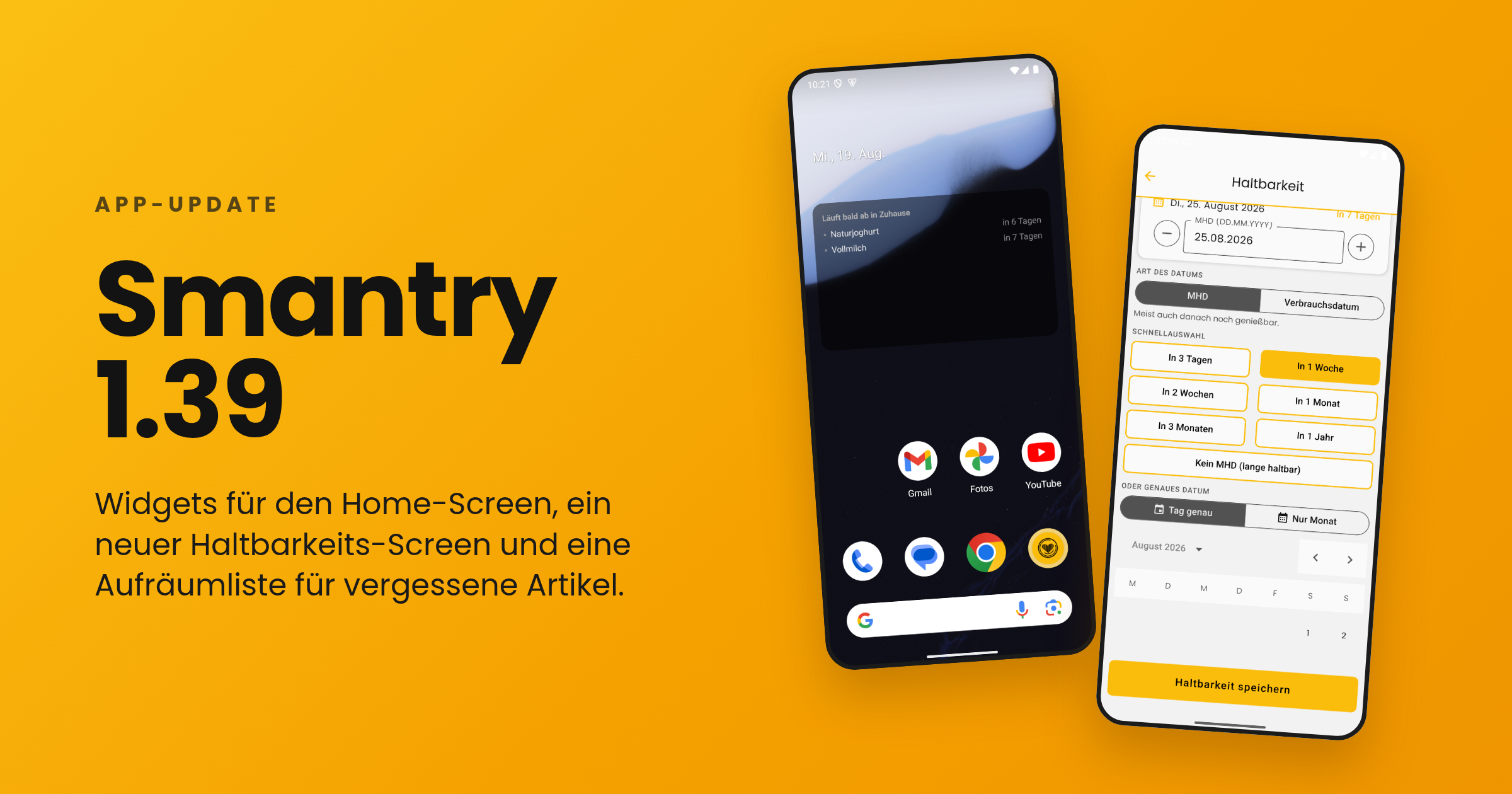
We’ve made adjustments to the new durability screen introduced in 1.39 based on the feedback we received:
- One tip instead of two: The date input opens directly, without an intermediate step.
- The year list now starts with the current year – instead of somewhere in the forties, requiring minutes of scrolling to reach the present.
- On the iPad, the dialog now follows the device's orientation, including in landscape mode.
- "Does not expire" is finally respected everywhere: no expiration indicator in the list and no best-before status for items you've marked as non-perishable.
- In the article detail view, the workflow status is now displayed as text instead of just as a colored dot.
Sign in: one tap, one account
Sign-in now takes place on a dedicated, secure sign-in page (`identity.smantry.com`) – and best of all, it opens with a single tap and already knows whether you wanted to sign in or register. Cases that previously resulted in two accounts being created because an email address was already linked to a different sign-in method now prompt you for confirmation instead of displaying an error.
By the way: New accounts are now set up in your language. Previously, welcome content and emails could appear in English without warning, even though the app was running in German.
Further improvements
- Full-size product images: Tapping a product image now opens it in full view again—even directly from the inventory list, and above the header instead of below it.
- Form stays open: When you select a photo while creating a new product, the form no longer closes—your entries remain in place.
- All storage locations in the Move dialog: When moving an item, not all destinations were always visible. Now they are.
- Create storage location: If creation fails, the app now tells you instead of silently doing nothing. It also now rejects names consisting only of spaces.
- Printing on Android: The stock list printed as a PDF can be reopened.
- Product database: If a product cannot be synchronized with the product database when saving, you will now be notified—instead of it being silently lost.
- Barrierefreiheit: Filterzeilen werden korrekt als Auswahlkästchen angesagt, die Knöpfe für den Entnahmegrund haben sprechende Labels, und kleine Knöpfe halten wieder die 44-Punkt-Mindestgröße ein.
- Weniger Fehlalarme: Kurze Netzwerkaussetzer werden nicht mehr als Fehler gemeldet, und hängende Verbindungen zur Datenbank stellen sich selbst wieder her, statt in einer leeren Liste zu enden.
Und für Unternehmen: Smantry Enterprise
Ein großer Teil der Arbeit dieser beiden Versionen ist im Privathaushalt unsichtbar, weil er für Betriebe gedacht ist: Haushalte können jetzt zu einem Unternehmen gehören, mit Rollen, Sitz-basierter Abrechnung und einem Protokoll aller Bestandsänderungen. In der App siehst du davon nur, was dich betrifft – etwa den Hinweis „Dieses Konto wird von deinem Unternehmen verwaltet" – und die Möglichkeit, Material an Personen auszugeben und zurückzunehmen, direkt am Telefon.
Wenn du Smantry beruflich einsetzt: Schreib uns, wir zeigen es dir.
Jetzt aktualisieren
Smantry 1.42 steht im App Store und bei Google Play bereit. Ein Tipp auf „Aktualisieren" genügt – und dann nimm dir zehn Minuten für den neuen Inventarmodus. Ein Lagerort reicht, um zu sehen, worum es geht.
Du hast Feedback zu den neuen Funktionen oder eine Idee für die nächste Version? Sag es uns direkt in der App über den Support-Chat oder im Feedback-Portal. Der „unter Mindestbestand"-Filter, der Ein-Tipp-Kalender und der monatsgenaue Modus sind genau dort entstanden.